home weekly reflections assignments fab academy notes

fabacademy challenges

Weekly projects and monthly challenges


This week was a bit hard for me to follow, because I was one of the only people online and because I had a high fever from COVID. I struggled to hear what people were saying and got lost because I only received the correct zoom link 45minutes into the class. For this reason, I unfortunately don't have much to say about Wednesday's class, but I will make sure to catch up with my peers' notes.

This was the homework we were asked to submit:
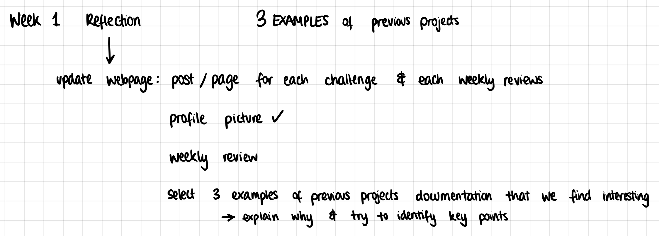
homework

This was the profile picture I decided to choose:
It was taken this summer when I was on holiday in a beautiful little island in Greece, called Milos. It was taken on 35mm film, and there was something wrong with this roll because each picture had a long blue line cut through the center of it. I was annoyed at it at first, but now I think it's actually kind of cool

The three websites I have chose from last year's MDEF class are the following:

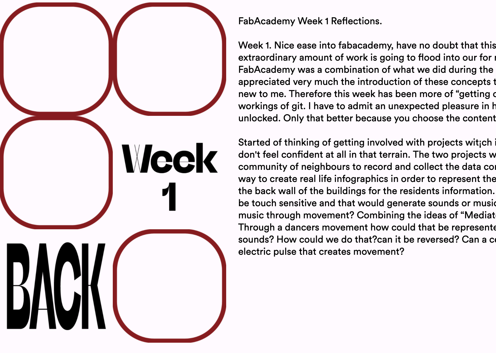
Jana

jana jana

Straightforward, concise and interesting graphics. I liked the 70s inspired images she used and the buttons were big enough to see and navigate around. Even though it's not the style I am personally using, I can still admire the interface she chose.

Mark

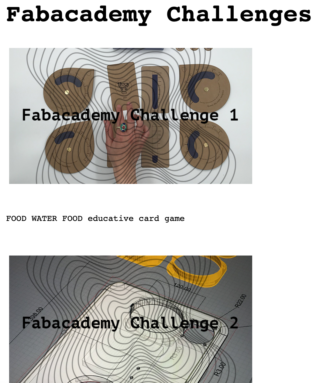
mark mark

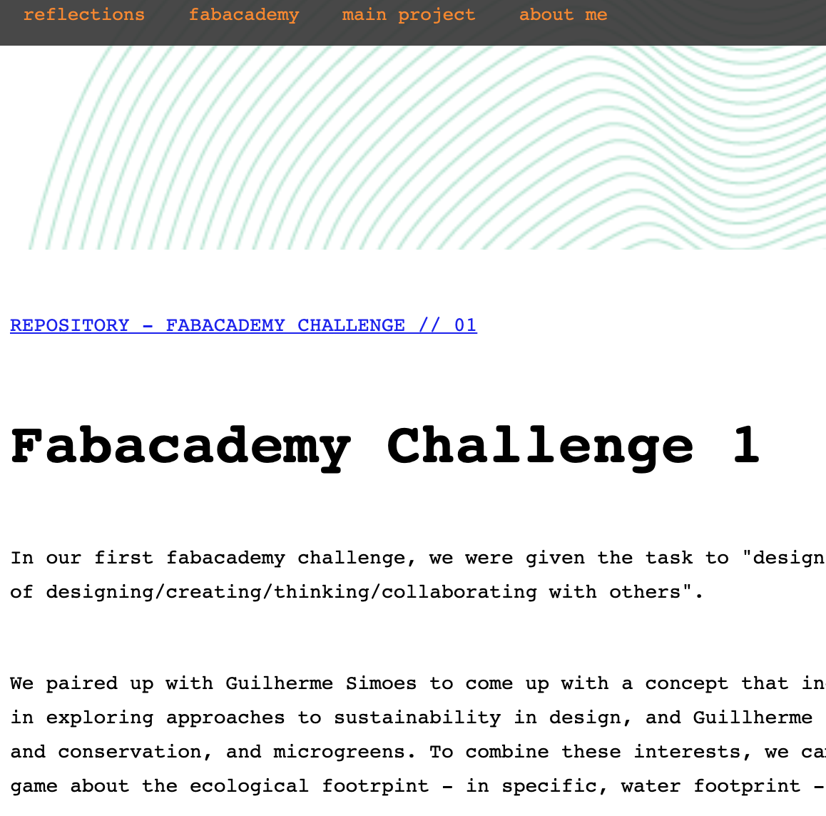
I liked how everything was easy to find and how the graphical element of the waves was consistent around the website. I like to see a good theme when navigating around a website. As for his writing style, it was also easy to follow along and understand the projects that he was working on. I couldn't find any of the weekly reflections, though.

Jose

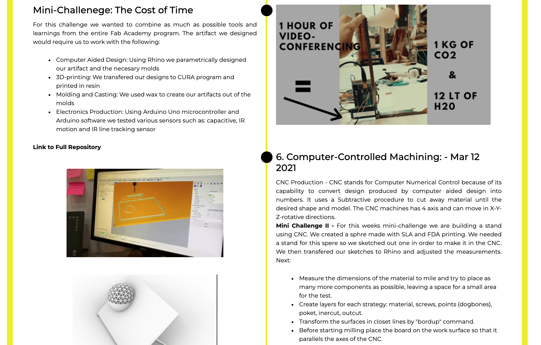
jose

This may have been one of my favourites. I really appreciated the way his reflections seemed like little stories. It was like I was following a linear timeline, with bullet points, gifs and sketches all around to help me get a great understanding of the work.

I made sure to choose websites that I somewhat understood and felt capable of replicating, that seemed to use html rather than plug-ins such as webflow or wordpress. I was sad to find that a lot of the ex-students' websites were inactive or not user friendly. However, the websites I chose were truly beautiful and very well navigable, so I hope to make mine the same too.

Back